Client: Stylee Clothing Store
Duration: 8 Weeks
Role: User research, UX& UI design, prototyping, user testing
Tools: Figma ,OptimalSort, Maze, Miro, Adobe Illustrator
Design a brand identity and responsive e-commerce website for Stylee — a global clothing retailer entering the online market. The site needed to serve a diverse, style-agnostic audience with intuitive browsing, robust filtering, and a seamless path to purchase.
Stylee had strong offline brand recognition across 400+ stores in 32 countries, but no online presence. The core challenge was translating that in-store experience into a digital one — competing with well-established e-commerce players while creating a brand identity modern and inclusive enough to appeal to all ages, styles, and demographics.
A research-driven design process — combining user interviews, competitive analysis, and card sorting — informed a responsive website built around Stylee’s core value: accessible, affordable style for everyone. The final deliverable included a new logo, complete UI kit, and high-fidelity prototype validated through usability testing with 7 participants.
Founded in 1994, Stylee is a global clothing retailer positioning itself alongside brands like Old Navy and H&M — offering accessible, affordable fashion for every occasion. With over 400 stores across 32 countries, Stylee has a strong offline presence and a loyal customer base. Their core philosophy: clothing should be affordable, changeable, and accessible to everyone. Despite their offline success, Stylee had no e-commerce presence — creating a significant opportunity to capture online shoppers and convert loyal in-store customers.

The central research question was: how can we provide online shoppers with a great experience that satisfies both existing in-store customers transitioning to digital, and online-first shoppers currently buying from competitors?
One-on-one interviews formed the foundation of the research phase. Talking directly with potential users revealed their expectations, frustrations with existing e-commerce sites, and the specific features they considered essential for a positive shopping experience.
With Stylee entering an already competitive online fashion market, a thorough competitive analysis was essential. Examining what established players did well — and where they fell short — provided clear design benchmarks and revealed opportunities to differentiate.

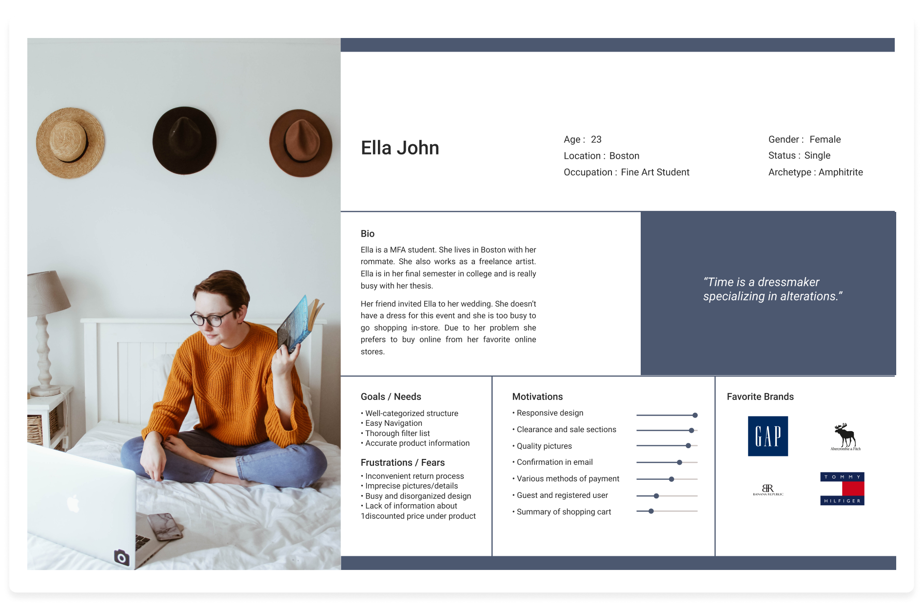
Interview insights were synthesised into a single user persona — Ella — capturing the goals, needs, and frustrations of Stylee’s target shopper. Ella became the reference point for every design decision throughout the project.
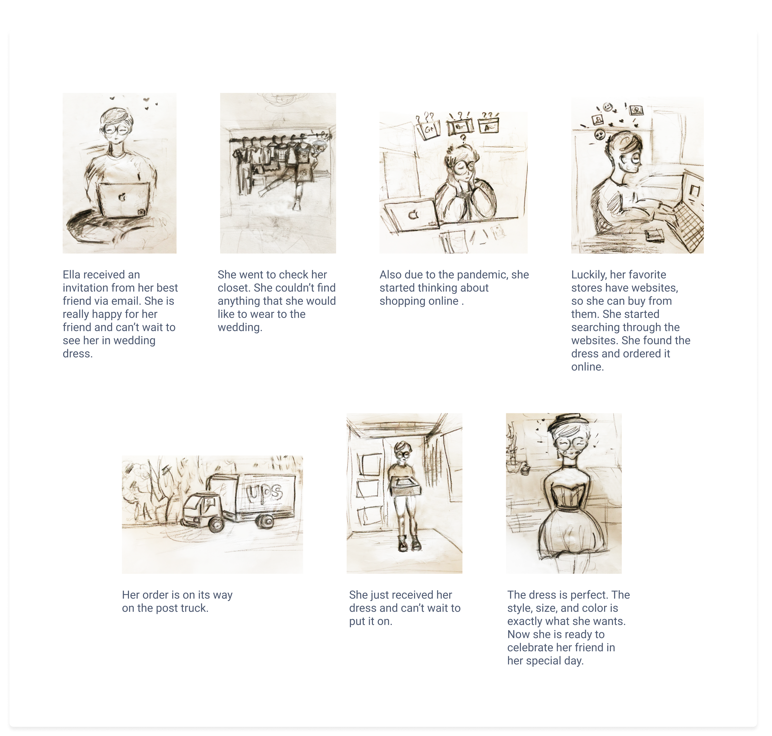
A storyboard mapped Ella’s end-to-end journey — from discovering Stylee online to completing a purchase. This narrative helped identify friction points early and ensured the design addressed real-world user behaviour.



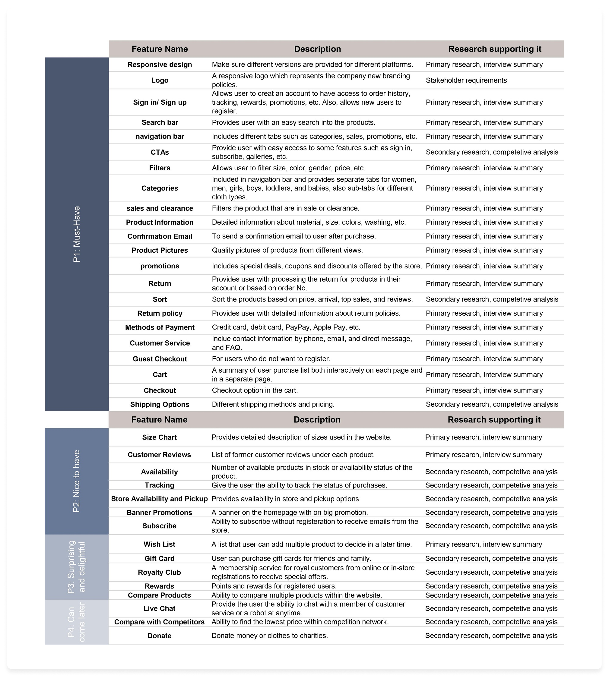
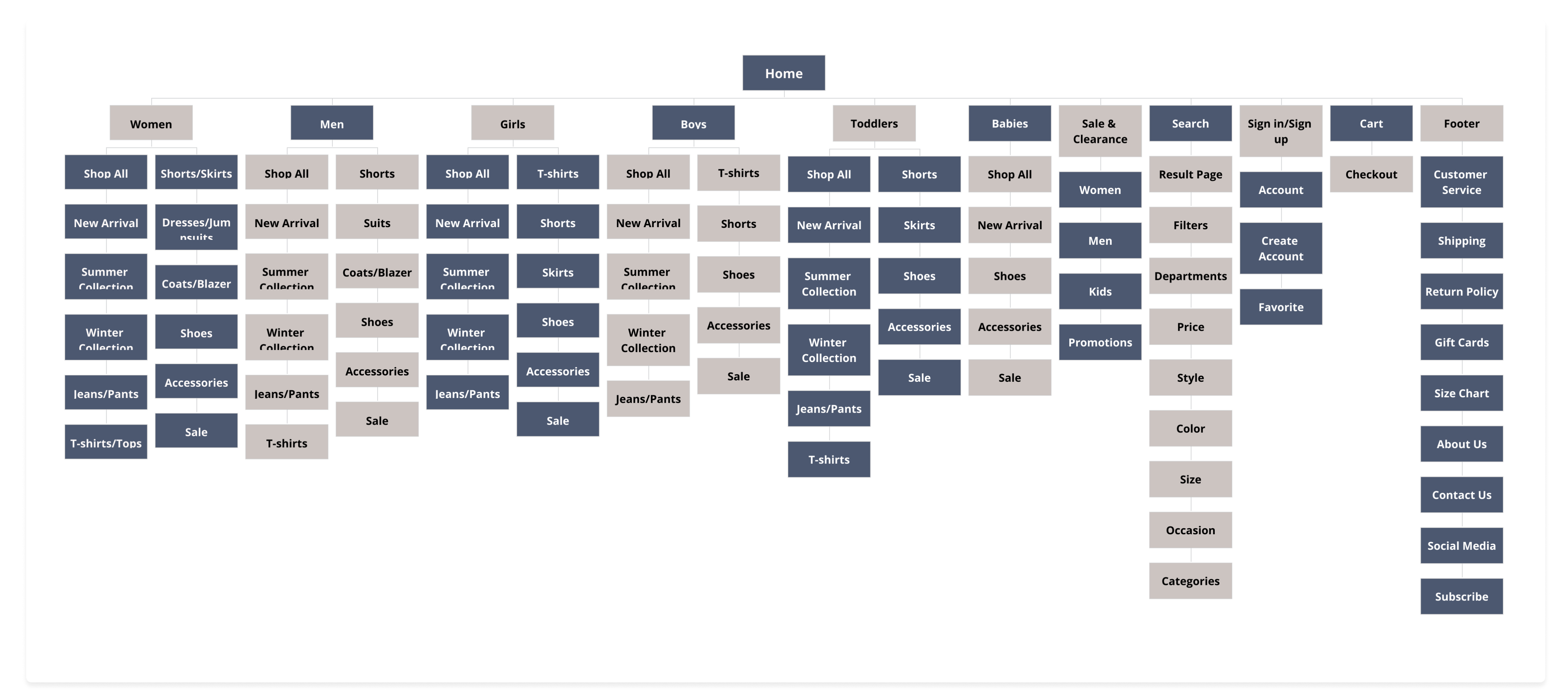
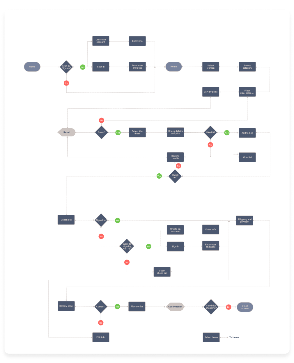
Research findings were translated into a structured information architecture — including a feature roadmap, sitemap, and task flow. The sitemap was validated through card sorting with multiple participants, ensuring the navigation reflected users’ mental models rather than internal assumptions.




Ideation Sketches
- Provide Distinct Categories For Clothing
- A Wide List Of Filtering Capabilities
- Detailed Product Description
- Utilize A Number Of Pictures For Each Product
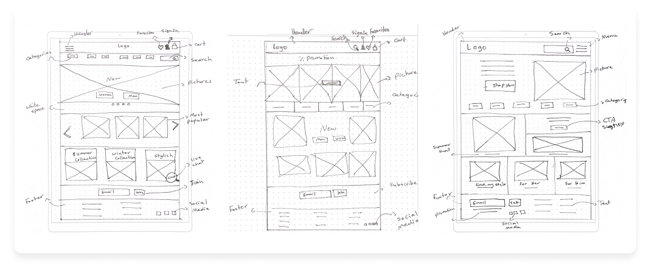

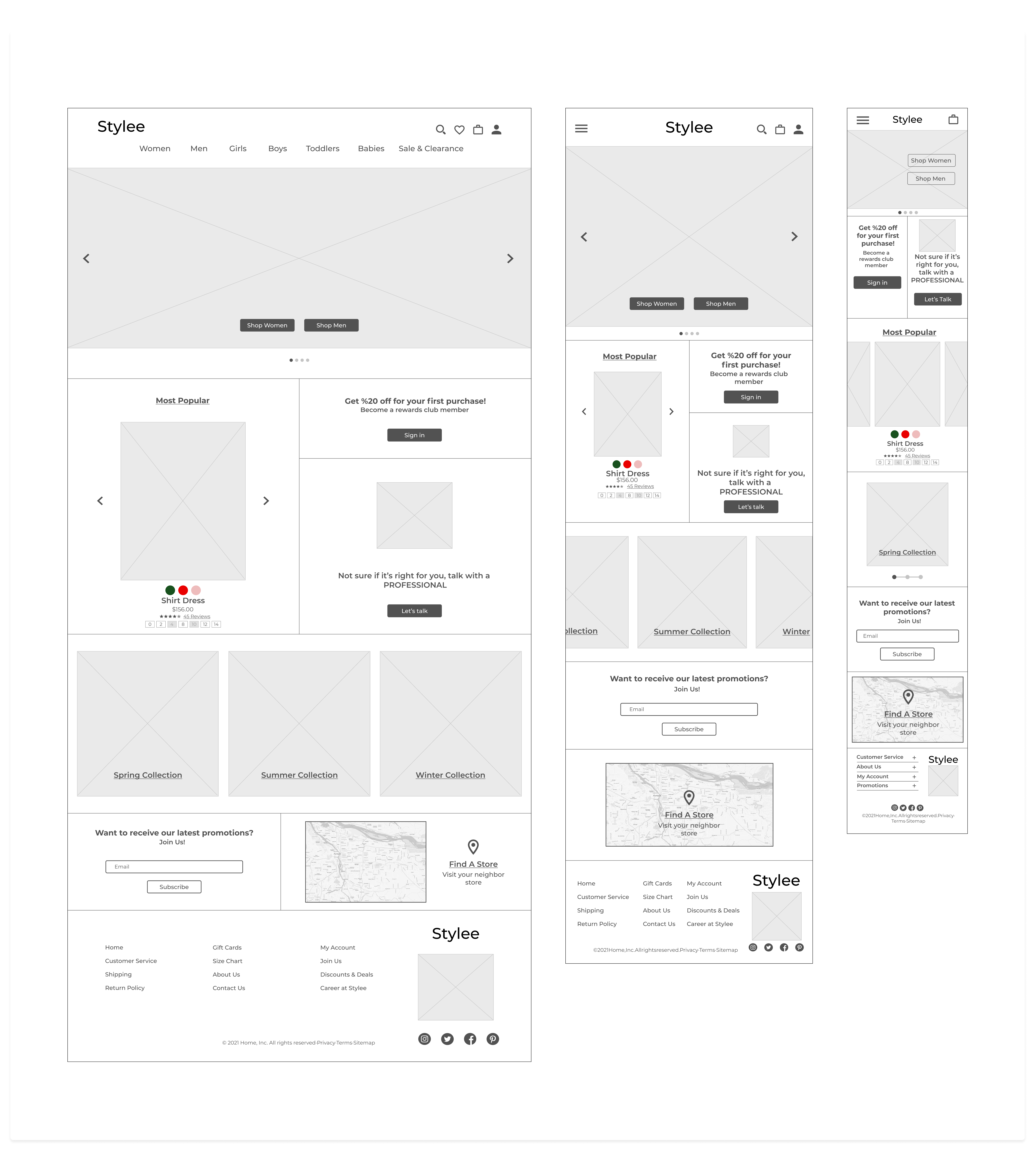
Initial sketches were translated into responsive digital wireframes in Figma — covering desktop, tablet, and mobile versions of the landing page, plus additional key screens for the desktop experience.

Prior to creating the high fidelity design, I finalized all the UI elements and combined them into the UI kit to facilitate the design.


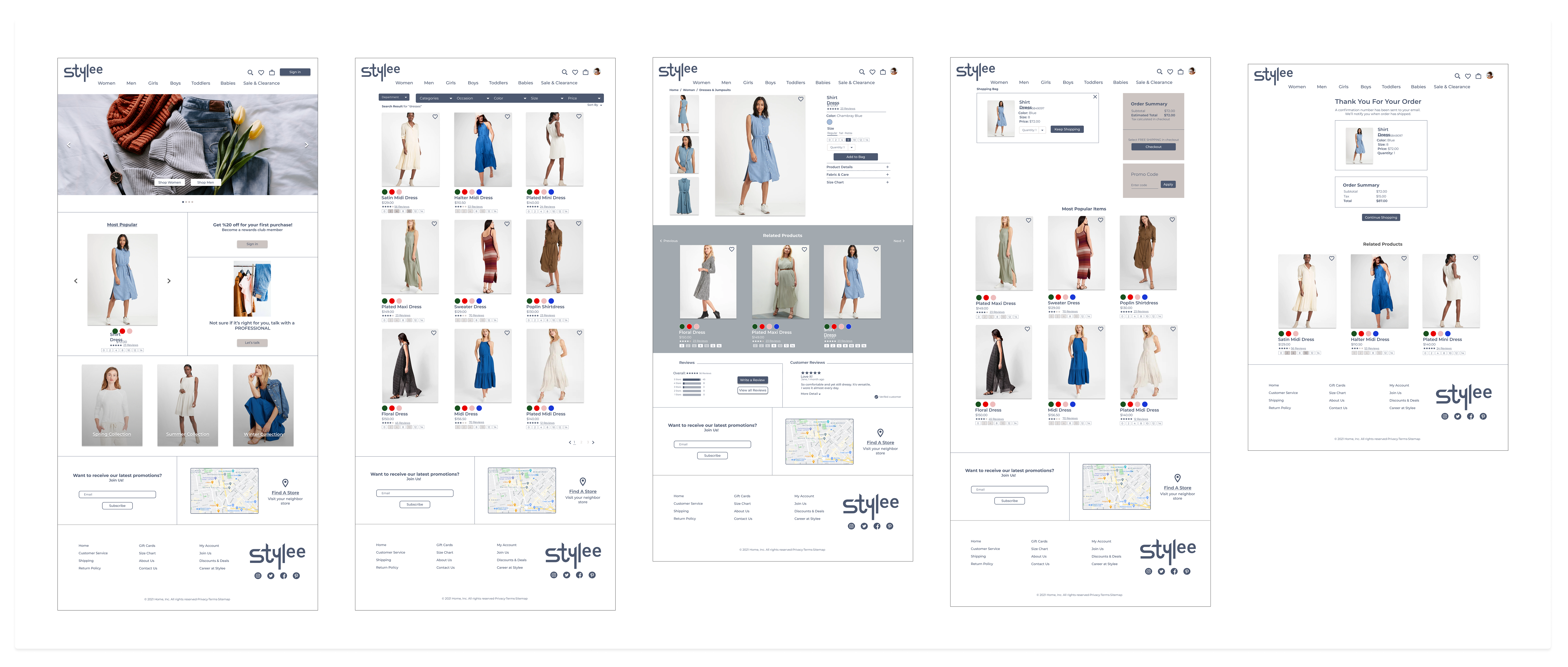
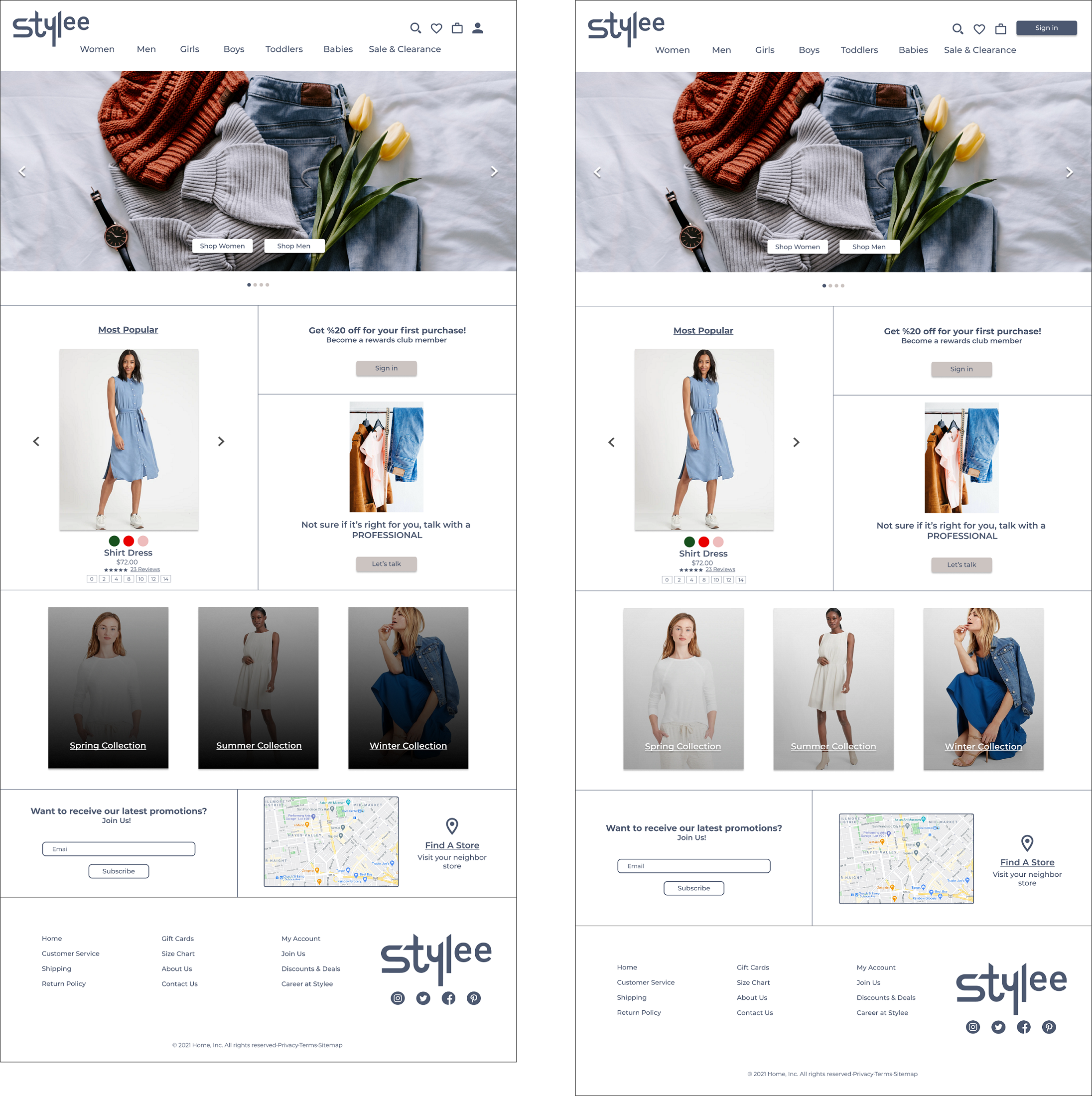
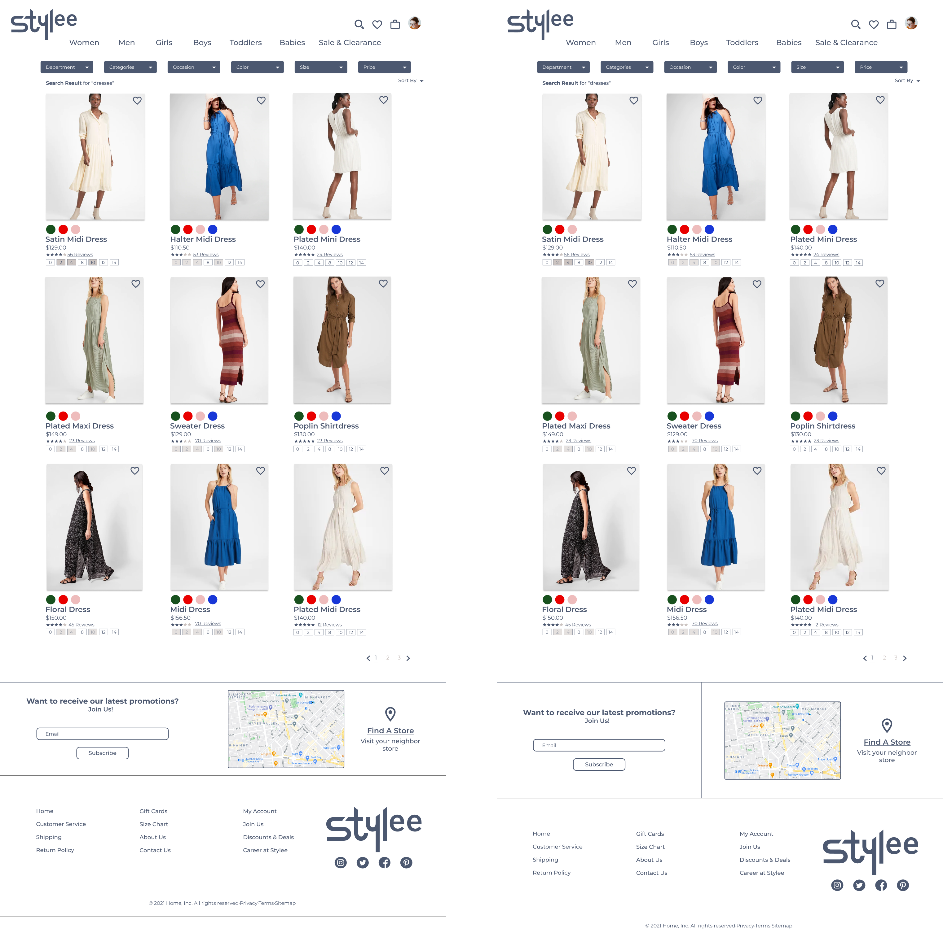
With the UI kit in place, I applied the visual system to the wireframes to produce high-fidelity designs. All pages required to support the defined task and user flows were designed at this stage.

Hi-Fi Design v1

A clickable prototype was tested with 7 participants — both in-person and through Maze. Results were synthesised into an affinity map, which prioritised iterations based on user frustration points and satisfaction drivers, directly informing the final design revisions.




Bringing a decades-old offline retailer into the e-commerce space required balancing brand familiarity with modern digital expectations. The most valuable lesson from this project: time invested in research — particularly understanding the gap between what Stylee’s customers expected and what competitors were failing to deliver — directly shortened the design iteration cycle and produced a more focused, user-validated final product.
