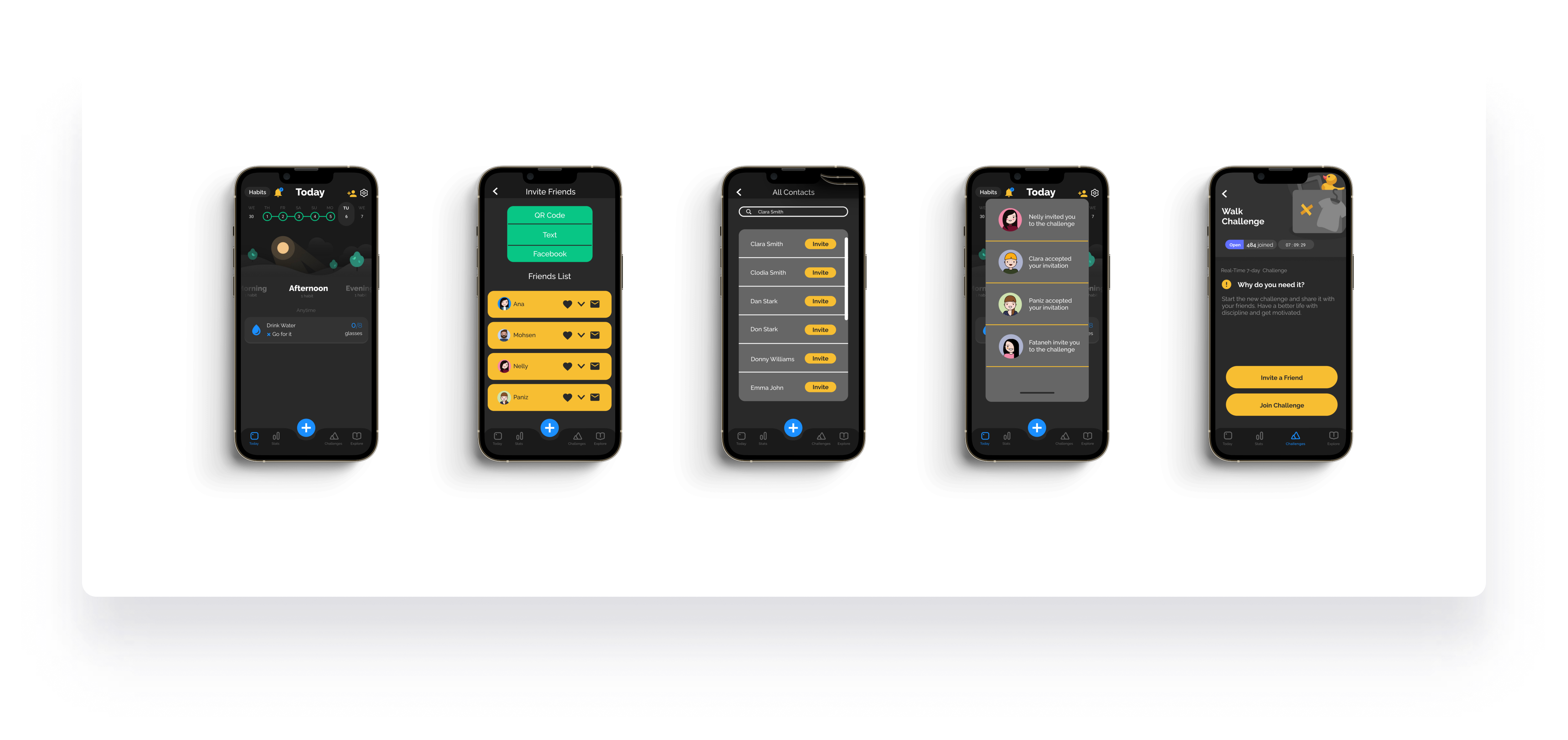
Client: Productive App
Duration: 4 Weeks
Tools: Figma , Adobe Photoshop, Maze, Adobe Illustrator
Responsibilities: User research, UX & UI design, Prototyping, User Testing
Extend the Productive app’s existing feature set by designing a social layer — enabling users to share habits and challenges with friends, send invitations via multiple channels, and communicate within the app.
People who use their smart phones for daily planning, organization, and task management. Users include current Productive app customers as well as people who use similar habit tracking mobile applications.
While many are using the PRODUCTIVE app daily, the application suffers from limited communication and sharable features.
Productive is a habit-tracking app that helps users build positive routines, set personal goals, and track progress. The existing app was well-designed but lacked social features — a gap identified as a key driver for sustained user engagement. I was brought in to design new features that would allow users to share habits and challenges with friends, send invitations, and build accountability within the app. Research consistently shows that habit formation is more effective and sustainable when done alongside others.

Productive was not the only habit-tracking app looking to add social and communication features. A thorough competitive analysis of both direct and indirect competitors — including apps with similar social mechanics — was conducted to identify best practices, weaknesses, and design patterns already proven with users.
People who use organization and planning apps are goal oriented and usually have strong opinions regarding the way they would like to do things. To ensure user satisfaction, I decided to perform a series of 1-on-1 interviews with potential users experienced with such applications to understand the need and translate it to actionable design decisions.
Recommendations for Productive:
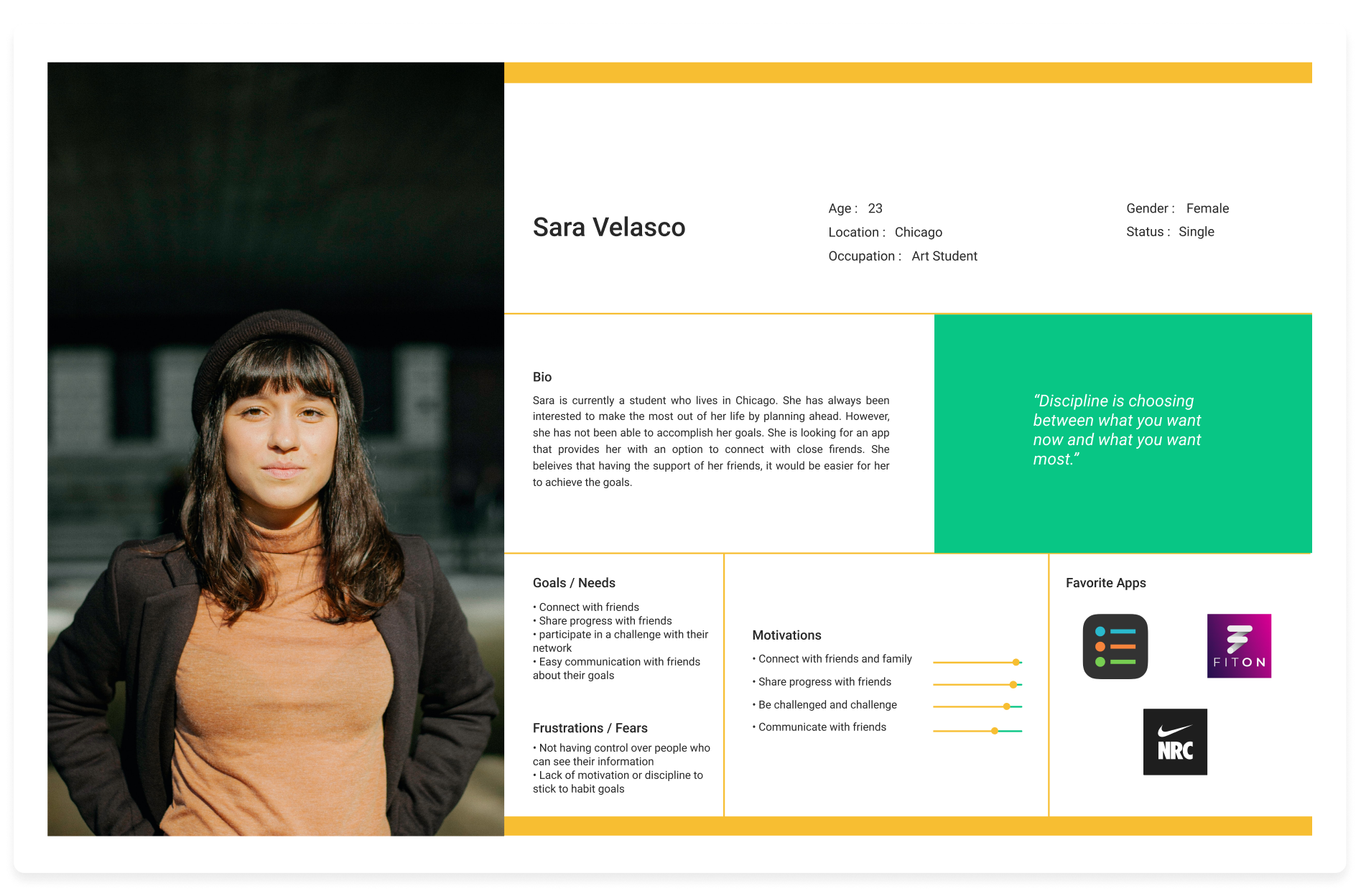
Based on the insights from user interviews, I developed a persona that guided my design decisions to a large extent.
Meeting Sara's needs and avoiding her fears became my main objectives. I tried to add features that give her the ability to connect and share, and customize the app to ensure all frustrations are removed.

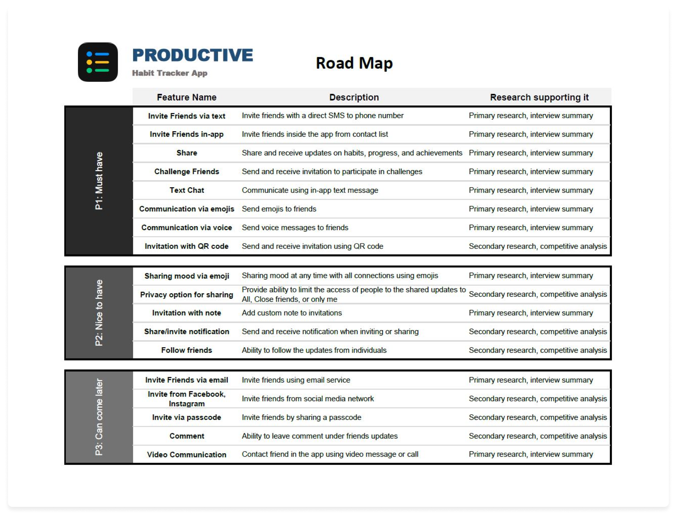
Drawing from research findings, I identified features that could be added within the project scope. Since implementing all potential features would require changes beyond the agreed scope, I prioritised them by importance — based directly on user interview feedback. This process culminated in a comprehensive roadmap mapping must-have and nice-to-have features.
With the prioritised features confirmed, I integrated them into the existing application map. A new top-level category — "Friends" — was introduced to house the new social features, while additional functionality was distributed across existing categories to maintain the app’s established navigation structure.


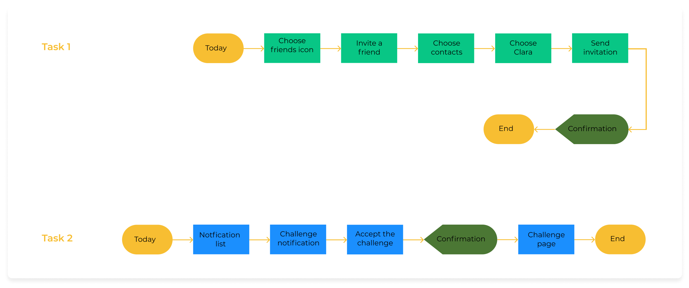
A user-centered product requires the design process to be formed around user actions. Hence, I created a few possible user tasks as a framework for the specifics of my design.

The ideation phase was conducted around a few major decisions:
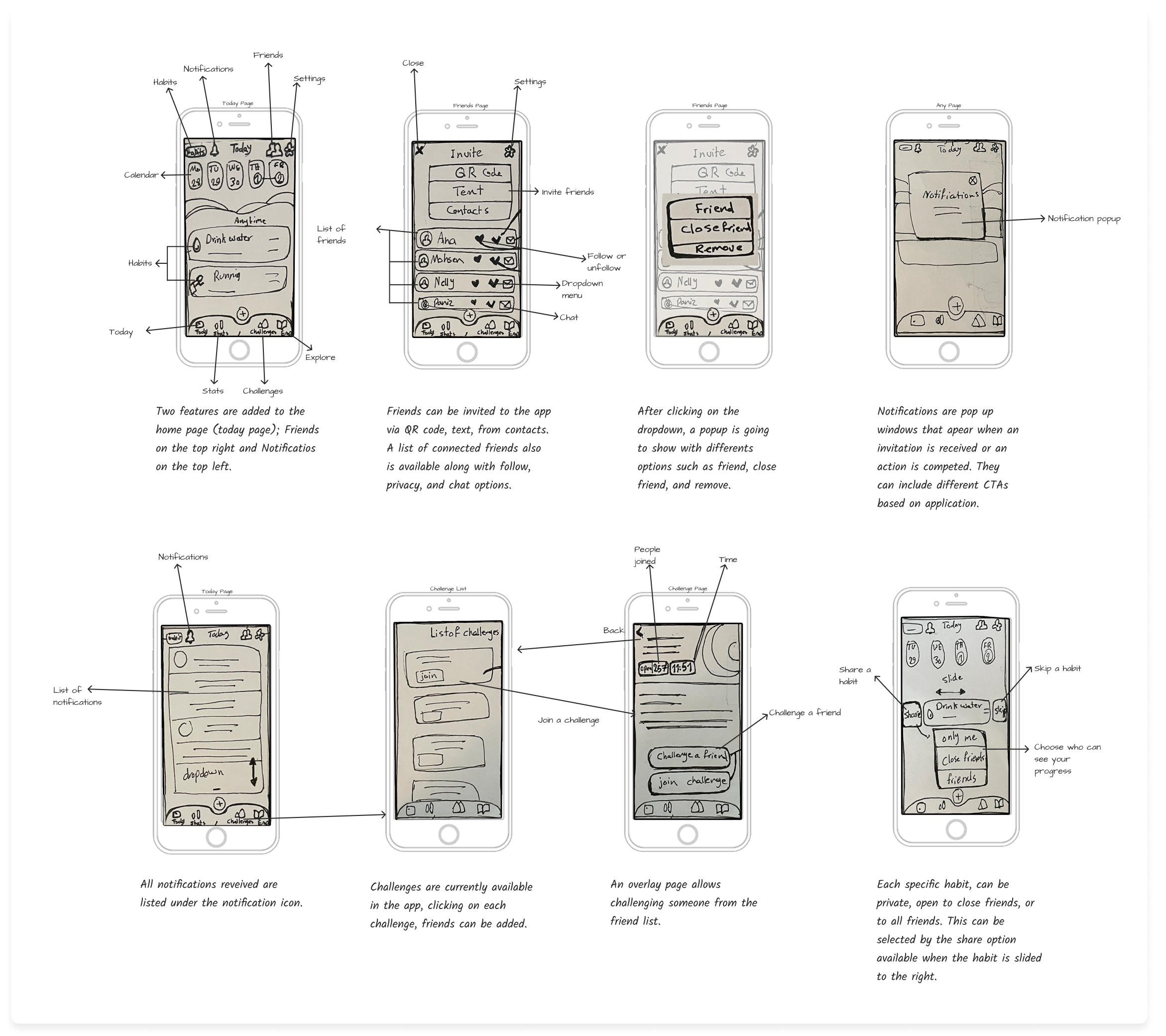
First iteration on digital wireframes
- Main page "Today"
- "Notification" overlay
- "Invite" / "Accept"
- "Confirmation"
- Custom privacy
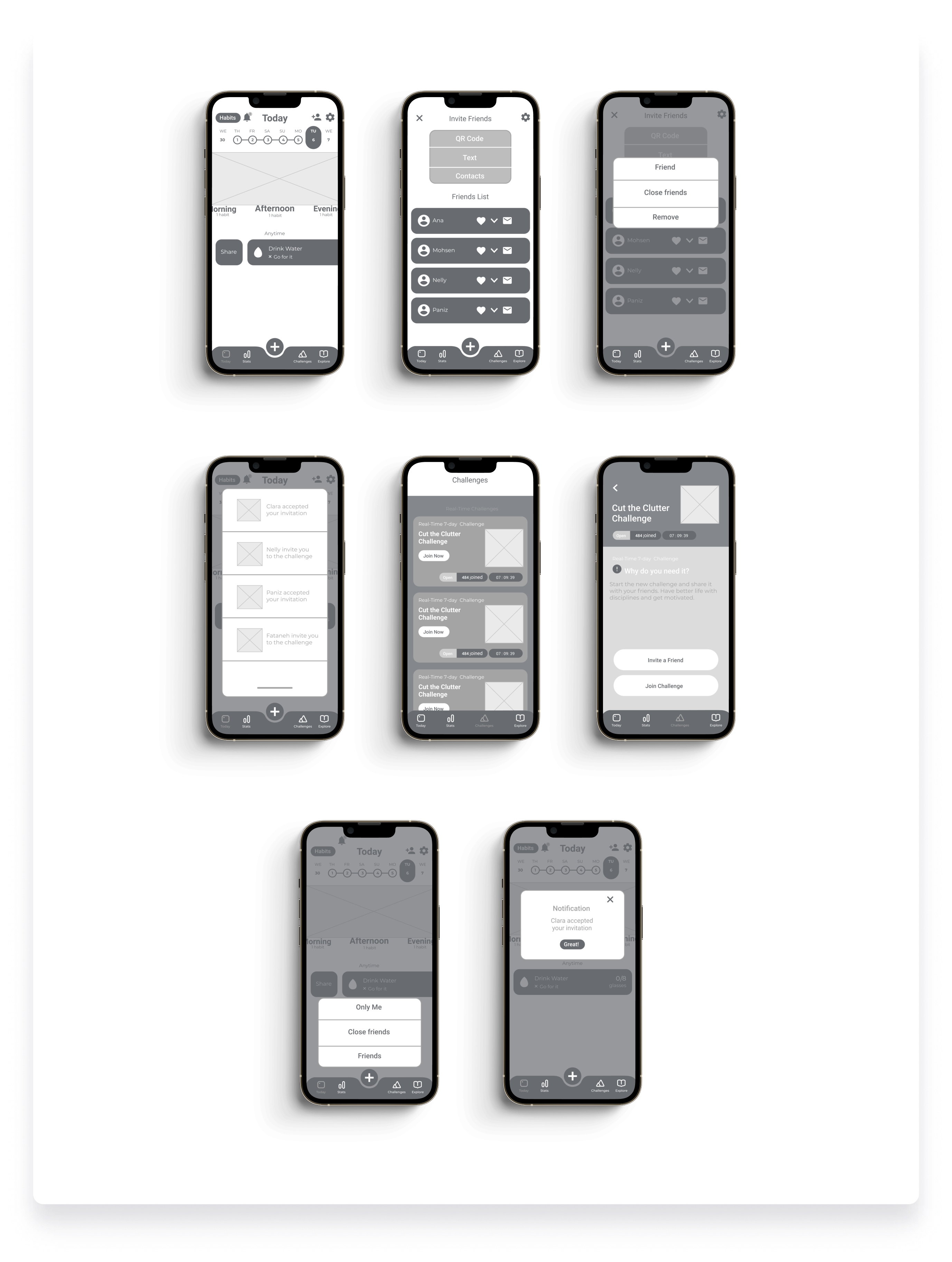

To understand the improvement opportunities in the design, I put the wireframes into user testing. Participants were asked to complete two tasks:
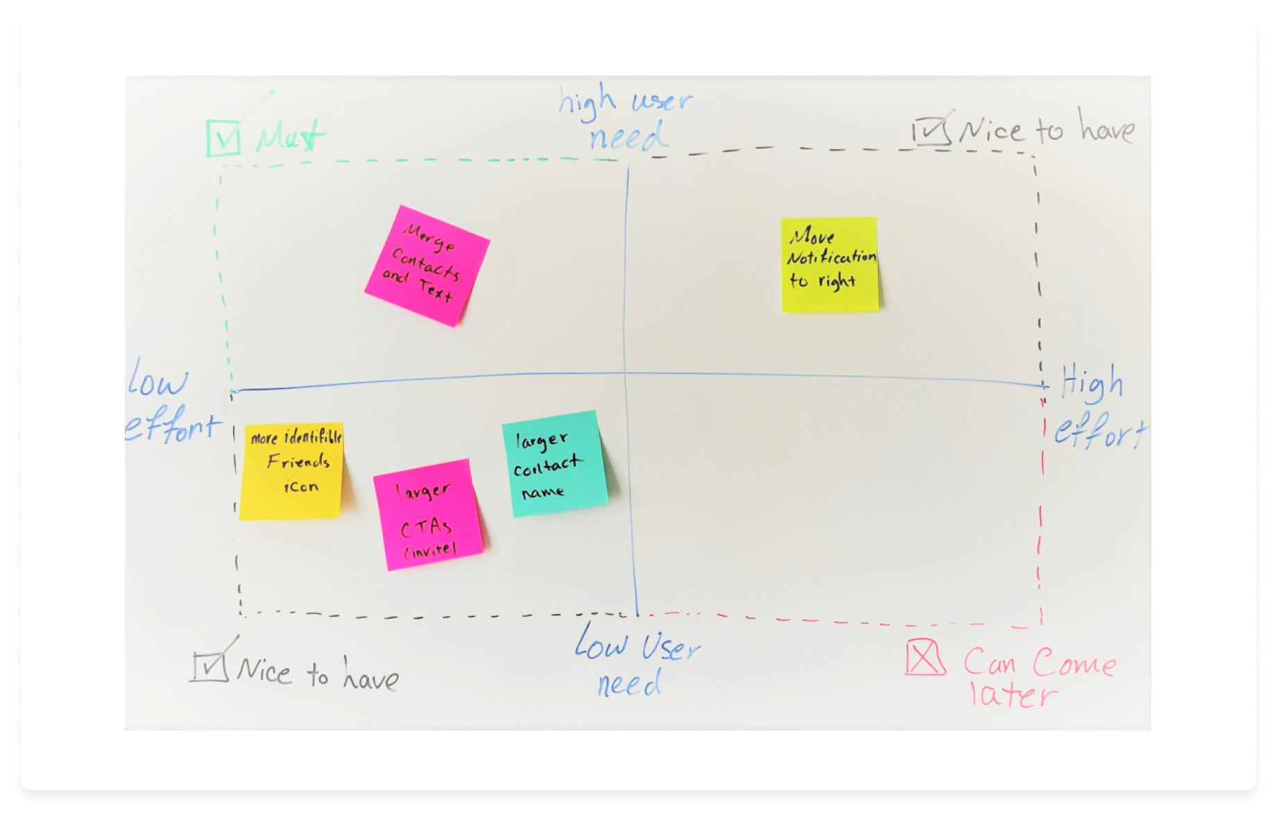
Iterating on wireframes based on the usability test results and a decision matrix ensured me that users are satisfied with the overall arrangement and features of the app before creating the high-fidelity prototype.
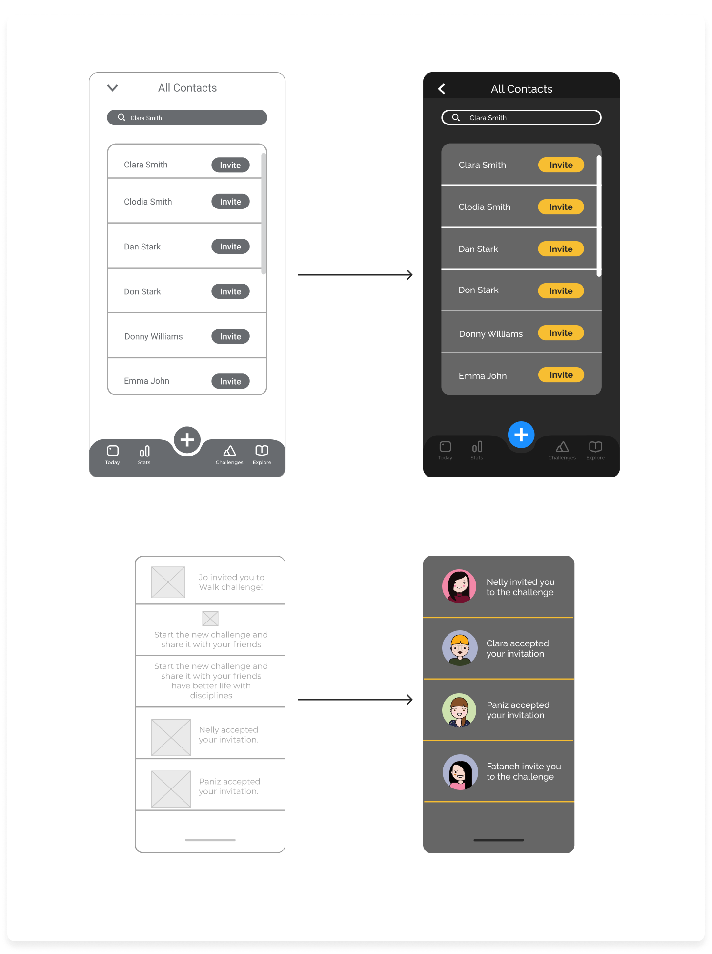
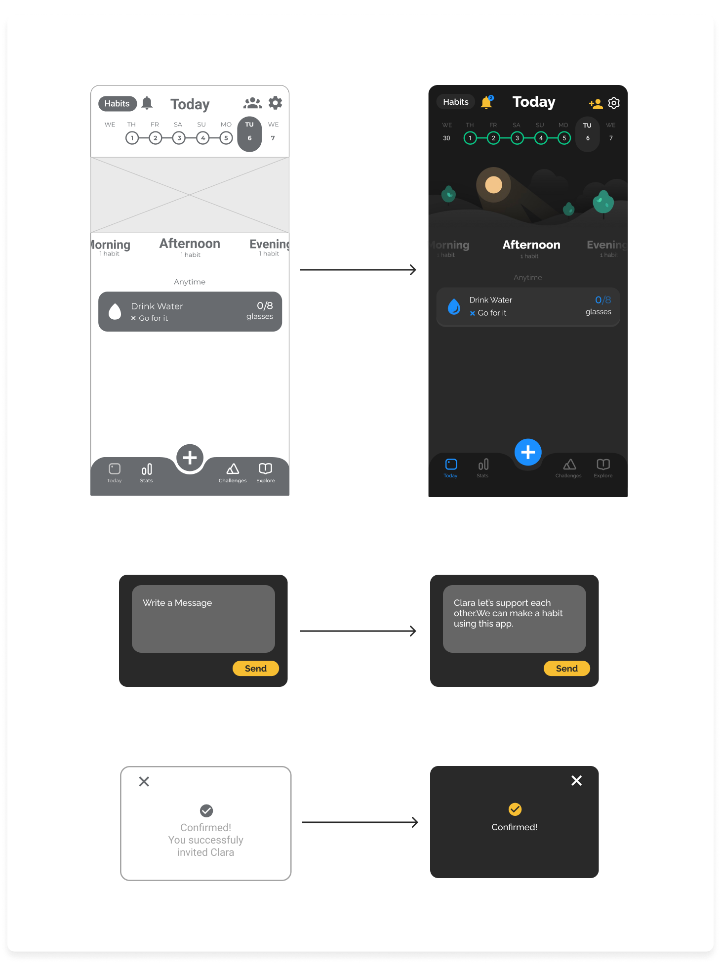
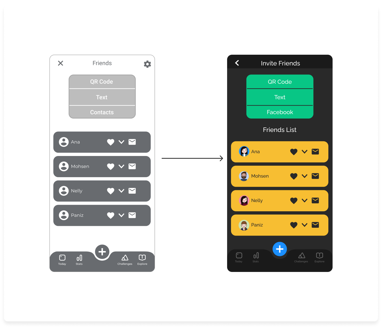

This project was particularly exciting for me since it gave me the opportunity to build upon the work of an amazing design team. Given the success of existing app, I tried to preserve the look, color palette, and spirit of the application. This created a special challenge for me when adding more features that needed to be distinguishable yet not disturb the existing theme. User research and final testing helped me a lot in structuring my thoughts and to create a completely user-centered design which was successfully tested by 16 potential users.
